By Kaja Bolton
If you've ever walked into a room and felt an instant shift in mood, you've experienced exactly what color does for a listing. I want to help you use that same effect in your Hoboken home before it ever hits the market. The right palette can make a rowhouse living room feel brighter, a bedroom feel calmer, and a kitchen feel more current, all without a single structural change. Let's talk about how color choices can help your rooms pop for the buyers touring your block.
Key Takeaways
- Learn how color temperature changes the way buyers perceive room size and light
- Find out which palettes read best in Hoboken's classic brownstone interiors
- Discover which colors help original trim and moldings stand out instead of fading into the walls
- See how to choose tones that photograph well for online listings
Why Color Choices Matter More in Hoboken's Older Housing Stock
Hoboken's masonry row houses and turn-of-the-century brownstones were built with narrower window openings and lower ceiling heights than newer construction, so the colors on the walls do more work here than they would in a wide-open new build. The right palette can make these rooms feel considerably more open than their actual dimensions suggest. Buyers touring these blocks, whether near Hoboken Terminal or the walk-ups closer to Elysian Park, are quick to notice when a color choice works against a room's proportions rather than with them.
How Color Temperature Changes the Way a Room Reads
- Warm whites reflect more light in rooms with limited window exposure on interior-facing walls
- Cool grays can make deep, narrow rowhouse layouts feel longer and more defined
- High contrast between trim and wall color draws attention to original architectural details
- A deeper accent tone in a single room adds visual interest without overwhelming a small floor plan
Choosing Palettes That Complement Hoboken's Architecture
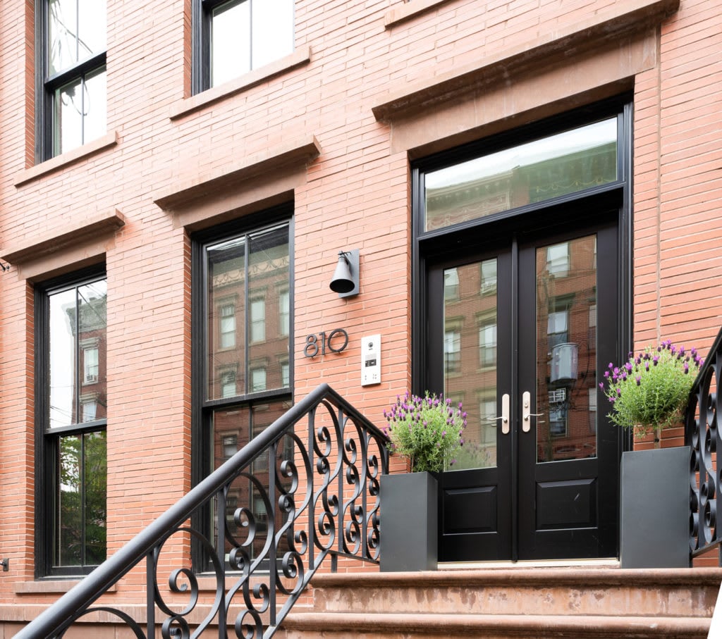
Between the exposed brick, tall baseboards, and decorative molding found in many Hoboken brownstones near Church Square Park and Stevens Park, a good paint palette should support those original details rather than compete with them. That's a different approach than staging a newer condo, where the walls themselves carry more of the visual weight. Buyers drawn to Hoboken's older inventory are often looking for that architectural character in the first place, so a palette that erases it can work against a sale rather than for it.
Palette Choices That Highlight Original Architectural Character
- Soft neutrals on primary walls let exposed brick or original trim stay the visual focal point
- A slightly deeper tone on a single accent wall can frame a fireplace or built-in shelving
- Matching trim to a shade lighter than the walls keeps moldings visible without looking stark
- Consistent color flow between connected rooms helps compact layouts feel intentional rather than choppy
Room-by-Room Color Strategy for a Hoboken Listing
Not every room in a Hoboken home needs the same approach. Buyers touring multi-story rowhouses near Washington Street or the waterfront notice how each space transitions into the next, so a coordinated but not identical palette across floors tends to perform best. Rooms that face the waterfront tend to receive stronger natural light for more of the day, which can shift how the same color reads compared with an interior-facing room on the floor below.
Where to Focus Your Color Updates Room by Room
- Kitchens benefit from light, warm neutrals that make cabinetry and countertops feel current
- Primary bedrooms read best in soft, muted tones that support a calmer, more restful feel
- Home offices or dens can carry a slightly bolder accent since buyers expect more personality there
- Bathrooms photograph best in clean, light tones that make tile and fixtures look brighter
Getting Color Right for Photography and Online Listings
A large share of buyers see a Hoboken listing on a phone screen before they ever schedule a tour, so a palette that looks great in person also needs to translate well in photos taken under a range of lighting conditions throughout the day. Since so many Hoboken listings compete for attention in a crowded set of online search results, small differences in how a room photographs can influence whether a buyer schedules a showing at all.
Color Decisions That Photograph as Well as They Look in Person
- Matte or eggshell finishes reduce glare in photos taken near large street-facing windows
- Avoid stark white walls in every room, since they can photograph as flat or clinical
- Test a sample swatch at different times of day before committing to a full room
- Keep hallway and connecting-space colors consistent so listing photos flow naturally from room to room
FAQs
Do I need to repaint every room before I list my home?
Not necessarily. I usually recommend focusing on the rooms buyers spend the most time in, along with any space where the current color feels dated or clashes with the rest of the home.
What color works best for a small Hoboken rowhouse room?
Lighter, warmer neutrals tend to perform well in smaller rooms since they reflect more light, though I'm glad to look at your specific space and suggest options suited to it.
Should I match paint colors across every floor of my home?
Coordinated doesn't mean identical, and I can help you choose a palette that flows naturally from floor to floor while still giving each room its own character.
Contact Kaja Bolton Today
Color is one of the most affordable ways to change how buyers experience your Hoboken home, and getting it right doesn't require a contractor or a big budget, just a plan for where that color will do the most work. It can make the difference between a listing that blends in and one that stands out. If you're getting ready to sell and want help choosing a palette that highlights your home's best features, I'm here to help.
Reach out to me, Kaja Bolton, to see more of my work across Hoboken. I'd love to help you find the right colors to make your rooms pop for the buyers who walk through your door, and to talk through a plan that fits your timeline before you list.