By Kaja Bolton
Color is a staging tool — and in Hoboken's competitive market, the wrong choice can work against a seller as powerfully as the right choice works for them. I’ve walked through enough listings across the Mile Square City to know exactly how buyers respond to different color palettes: warm, grounded tones create an emotional pull that drives faster decisions, while cool or outdated schemes put distance between buyers and the home they are standing in. Choosing the right paint color before listing is one of the highest-return investments a Hoboken seller can make.
Key Takeaways
- Warm neutrals consistently outperform cool grays and stark whites with Hoboken's buyer profile.
- Color affects how large or small a room feels — a critical consideration in Hoboken's compact floor plans.
- A fresh coat of paint in the right tone signals a well-maintained, move-in-ready home before buyers notice anything else.
- Consistency across rooms creates the sense of flow and coherence that makes buyers feel at home.
Why Paint Color Matters More Than Sellers Expect
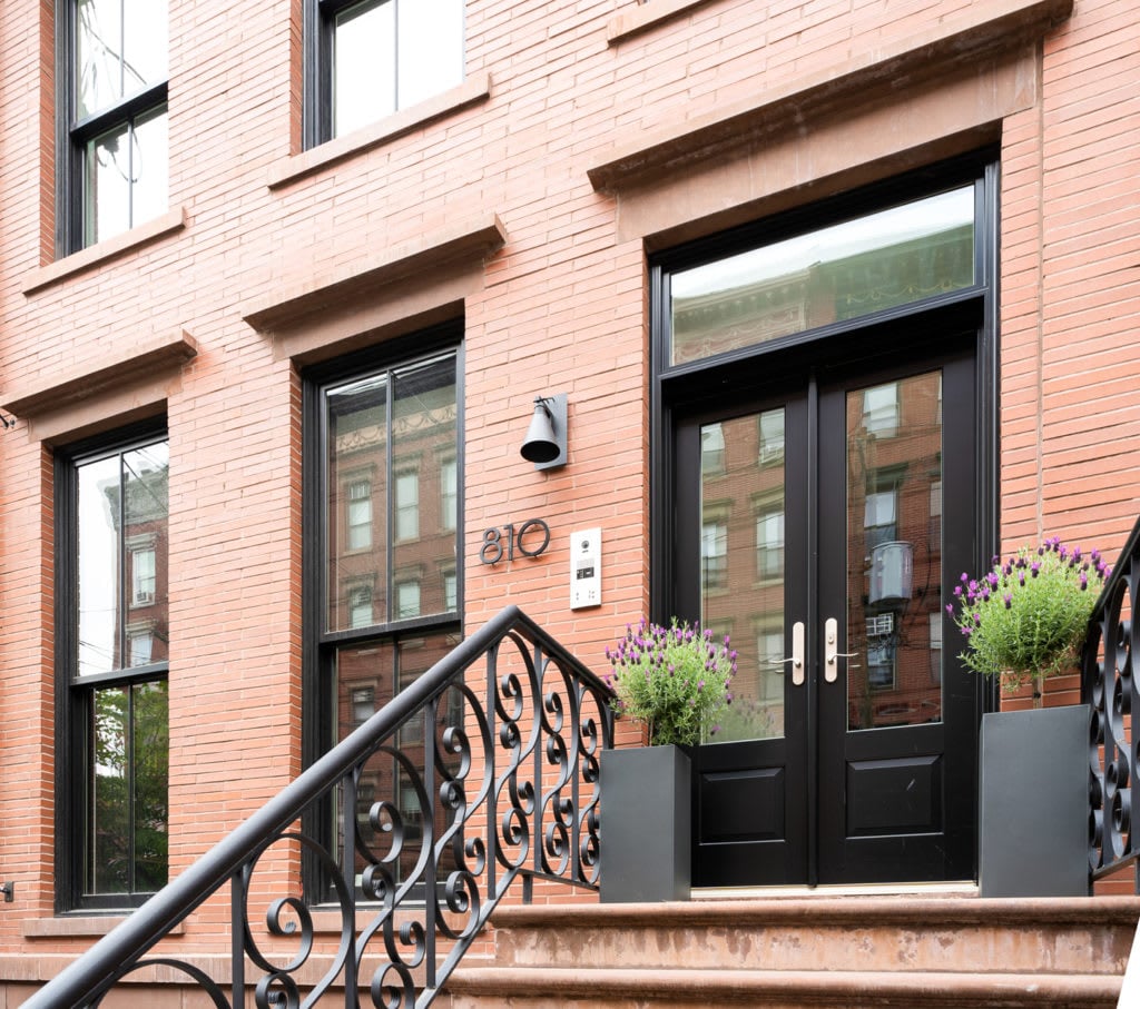
The buyer profile Hoboken attracts is discerning. Many are coming from Manhattan apartments or other high-end urban markets, and they arrive with a trained eye for design. A condo painted in an outdated beige or a harsh cool gray immediately signals a home that needs work — even if everything else is in excellent condition.
Paint is also one of the fastest ways to change how a room photographs. In an era when most buyers make their first showing decisions based on listing photos, a fresh coat of paint in the right tone directly affects click-through rates and showing volume. A well-painted home looks polished online. One with tired or conflicting colors gets passed over before buyers even read the listing description.
Paint is also one of the fastest ways to change how a room photographs. In an era when most buyers make their first showing decisions based on listing photos, a fresh coat of paint in the right tone directly affects click-through rates and showing volume. A well-painted home looks polished online. One with tired or conflicting colors gets passed over before buyers even read the listing description.
How Paint Color Affects Buyer Perception
- Warm, current tones create an emotional feeling of home — buyers relax into a space rather than evaluating it
- Cool or mismatched tones draw attention to walls rather than to the home's features
- Fresh paint signals care and maintenance, reducing buyer concern about deferred upkeep
- Consistent color across open-plan spaces creates visual flow that makes compact homes feel larger
The Case for Warm Neutrals in Hoboken
Hoboken's buyer pool has decisively moved away from the cool gray trend that dominated interior design for much of the past decade. The palette that resonates most with buyers touring brownstones along Garden Street or condos near the Hoboken waterfront is warmer — soft creamy whites, warm taupes, earthy greiges, and muted sage greens.
These tones work for multiple reasons. They read as current without being trend-dependent, which means they will not feel dated quickly. They complement Hoboken's architectural mix — both the historic character of the brownstones and the clean lines of modern condo interiors. And they photograph warmly, making listing images feel more inviting than the clinical quality that cool grays tend to produce.
These tones work for multiple reasons. They read as current without being trend-dependent, which means they will not feel dated quickly. They complement Hoboken's architectural mix — both the historic character of the brownstones and the clean lines of modern condo interiors. And they photograph warmly, making listing images feel more inviting than the clinical quality that cool grays tend to produce.
Top Performing Paint Colors for Hoboken Staging
- Creamy whites (such as Benjamin Moore White Dove): warm without being yellow, works in almost every room
- Warm greige tones (such as Sherwin-Williams Accessible Beige or Agreeable Gray): the safe, high-appeal middle ground
- Soft taupe: grounds a space without reading as heavy or dated
- Muted sage green: works particularly well in kitchens and primary bedrooms for buyers who respond to warmth with a nature-inspired edge
How Color Affects Perceived Space
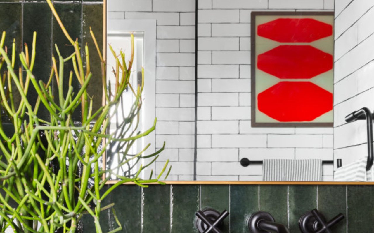
In Hoboken's compact floor plans — where many condos and brownstone apartments work with limited square footage — color becomes a spatial tool as much as an aesthetic one. Lighter tones in warm ranges make rooms feel larger by reflecting more light and creating a more expansive visual field. Darker tones can add drama and sophistication in larger rooms but require careful consideration in smaller spaces.
Ceilings are an often-overlooked opportunity. Painting ceilings in a tone slightly lighter than the walls — even a whisper lighter — draws the eye upward and makes rooms feel taller. In brownstones where ceiling heights are already generous, this reinforces one of the property's strongest selling points.
Ceilings are an often-overlooked opportunity. Painting ceilings in a tone slightly lighter than the walls — even a whisper lighter — draws the eye upward and makes rooms feel taller. In brownstones where ceiling heights are already generous, this reinforces one of the property's strongest selling points.
Color and Space Strategies for Hoboken Homes
- Use lighter values of warm tones in smaller rooms and bedrooms to maximize perceived space
- Paint ceilings in a slightly lighter version of the wall color to add visual height
- Keep open-concept living and dining areas in the same color family for uninterrupted flow
- Save stronger or deeper tones for an accent wall or a room with generous natural light where the darkness reads as intentional rather than limiting
Maintaining Color Consistency Across Rooms
One of the most common staging mistakes I see in Hoboken listings is a home where each room is painted a different color with no connecting thread. The effect is jarring — buyers move from room to room with their eye constantly readjusting, which creates discomfort rather than the sense of flow that makes a home feel coherent.
The goal is a consistent color family across the main living areas, with any variation remaining within the same warm tonal range. A living room in warm greige, a kitchen in a slightly lighter version of the same tone, and a primary bedroom in a soft complementary neutral all feel connected. A home where the living room is gray, the bedroom is builder beige, and the kitchen is painted a bold accent color feels like three different homes stitched together.
The goal is a consistent color family across the main living areas, with any variation remaining within the same warm tonal range. A living room in warm greige, a kitchen in a slightly lighter version of the same tone, and a primary bedroom in a soft complementary neutral all feel connected. A home where the living room is gray, the bedroom is builder beige, and the kitchen is painted a bold accent color feels like three different homes stitched together.
Color Consistency Checklist
- Choose one anchor neutral and carry it through the main living areas
- Allow variation in bedrooms and bathrooms within the same warm tonal family
- Avoid painting accent walls in tones that conflict with the rest of the home
- Treat trim and baseboards consistently throughout — bright white trim works with most warm neutral palettes and gives rooms a clean, finished edge
Frequently Asked Questions
Should I repaint my Hoboken home before listing even if the current color is in good condition?
If the current color is a cool gray, a dated beige, or an overly bold or personalized shade, repainting is worth the investment. If the current color is a warm neutral in good condition, a thorough clean and any necessary touch-ups may be all that is needed. The question to ask is not whether the paint looks fine — it is whether the color is working actively in the home's favor with today's buyer.
What about painting in Hoboken's older brownstones with plaster walls?
Plaster walls require proper preparation before painting — surface cleaning, any necessary repairs, and appropriate primer — to achieve a smooth, high-quality finish. The color selection principles are the same as in any Hoboken property: warm neutrals, consistent palette, with particular attention to how color interacts with the brownstone's original architectural details like moldings and trim.
How do I choose between two similar warm neutral tones I am considering?
Test both in the actual room before committing. Paint large swatches on the wall — at least a foot square — and observe them at different times of day and in both natural and artificial light. The way a color reads in a showroom or on a small chip is rarely how it reads on a full wall, and Hoboken's varied exposures affect how any given tone will appear.
Contact Kaja Bolton Today
Choosing the right paint colors before listing is one of the most impactful decisions a Hoboken seller can make — and one of the easiest to get wrong without the right guidance. I work with sellers throughout Hoboken and Hudson County to make sure every element of a listing is positioned to perform.
If you are preparing to sell and want an expert eye on your home before it hits the market, reach out to me, Kaja Bolton at Hoboken Living, and start the conversation today.
If you are preparing to sell and want an expert eye on your home before it hits the market, reach out to me, Kaja Bolton at Hoboken Living, and start the conversation today.