By Kaja Bolton
Color is the single most powerful and most misunderstood tool in home staging. I've walked into Hoboken listings painted in stark cool grays that photographs like a hospital and listings in warm, considered neutrals that immediately feel like home to buyers. The difference isn't square footage or renovations — it's color. Understanding the psychology behind how buyers respond to different tones is one of the most actionable advantages a Hoboken seller can have. Here's what I've learned preparing listings throughout the Mile Square City.
Key Takeaways
- Warm neutrals consistently outperform cool grays and stark whites in Hoboken's buyer market.
- Color directly affects how large or small a room feels — a critical factor in Hoboken's compact floor plans.
- Strategic color choices in staging can create emotional responses that move buyers from interested to committed.
- The goal is not a color that you love — it's a color that the broadest possible buyer pool responds to positively.
Why Color Psychology Matters in Hoboken's Market
Buyers touring Hoboken properties are making emotional decisions faster than they realize. Research consistently shows that people form a first impression of a room within 90 seconds, and color accounts for a significant portion of that impression. In a market where buyers are comparing multiple properties in the same neighborhood — brownstones along Bloomfield Street, condos near the waterfront, townhomes uptown near Maxwell Place — the home that feels most welcoming in those first seconds is the one that stays top of mind.
The Hoboken buyer profile skews heavily toward NYC professionals making a lifestyle decision to cross the Hudson. They're trading Manhattan square footage for Hoboken's walkability, the waterfront, and Sinatra Park — and they want their new home to feel more settled and comfortable than their city apartment. Warm, grounded color palettes deliver that feeling. Cool, sterile tones undermine it.
What Color Psychology Tells Us About Buyer Response
- Warm tones (cream, taupe, clay, sage) create feelings of welcome, comfort, and settling in
- Cool tones (cool gray, stark white, blue-gray) can feel clinical or temporary in residential spaces
- Light tones make rooms feel larger — crucial in Hoboken's compact layouts
- Dark tones create intimacy — useful in specific spaces, risky as a dominant palette
- Cohesive palettes across rooms make homes feel more polished and better maintained
The Warm Neutral Palette That Works in Hoboken
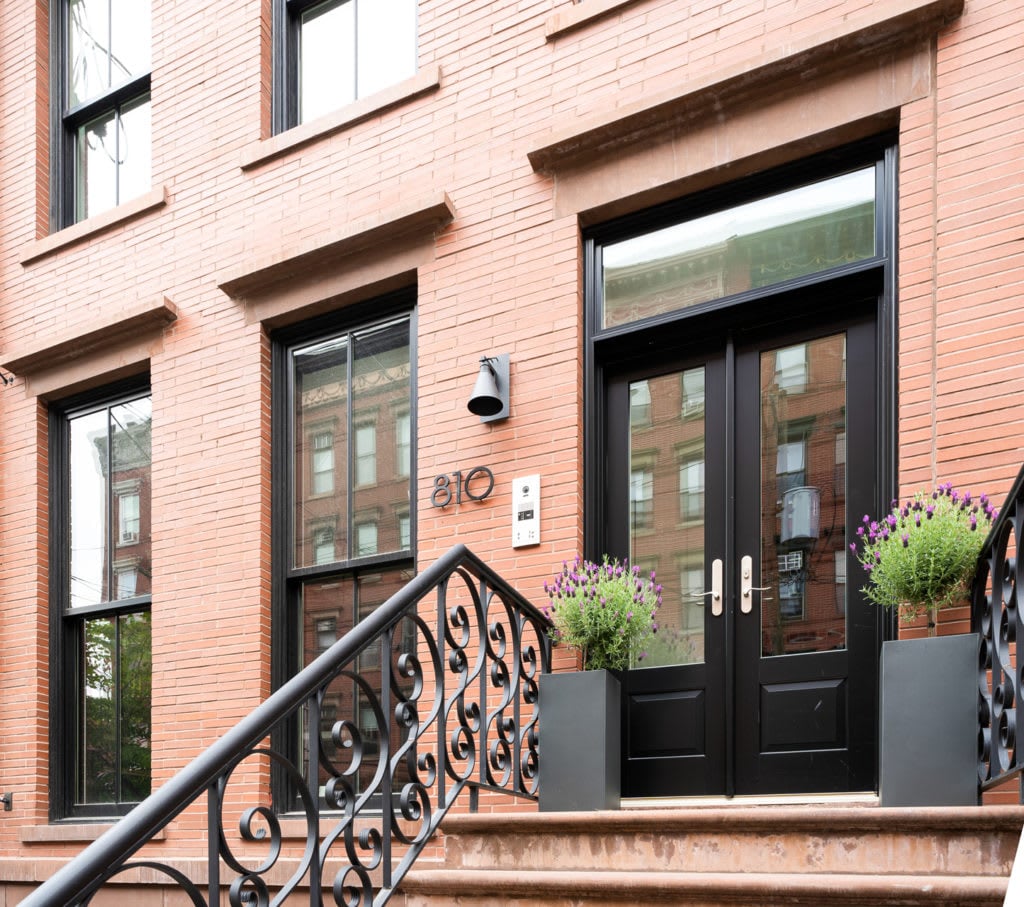
The most consistently effective staging palette for Hoboken properties is built around warm neutrals. Soft clay, warm taupe, greige, and creamy white all photograph well, complement the warm-toned hardwood floors common in Hoboken's brownstone and converted building stock, and appeal to the broadest possible buyer pool.
Stark white — while popular in design circles — often reads as cold and unfinished in Hoboken's residential context, particularly in north-facing units that receive cooler indirect light. Warm white with yellow or beige undertones performs significantly better, creating the fresh, clean look sellers want without the clinical edge that straight white can produce.
Cool gray, which dominated design trends for years, has faded with buyers and stagers alike. In Hoboken's light conditions — often limited in winter months and variable throughout the day — gray walls can shift to look blue, purple, or simply flat. It's a palette I steer sellers away from when preparing listings.
Warm Palette Options That Photograph Well in Hoboken Listings
- Warm white with cream undertones — clean, fresh, broadly appealing
- Greige (gray-beige blend with warm base) — current, versatile, complements wood floors
- Soft clay or terracotta accent — warming without overwhelming, works in living rooms
- Sage green — connects to nature, reads as sophisticated and current in the right space
- Avoid: cool gray, stark blue-white, and anything with heavy blue or purple undertones
Color and Perceived Space in Compact Hoboken Floor Plans
Color directly affects how large or small a room feels — and in Hoboken, where square footage is genuinely at a premium, this matters enormously. Lighter tones reflect light and make walls recede, creating openness. Darker tones absorb light and bring walls forward, creating intimacy that can read as cramped in already-compact spaces.
The most effective trick for small Hoboken rooms is painting the ceiling the same color as the walls rather than defaulting to stark white. This eliminates the visual break between wall and ceiling that makes rooms feel lower and more boxed-in. A warm white wall with a matching or slightly lighter warm white ceiling creates a sense of continuity and openness that dramatically changes how a compact room reads.
Consistent color throughout the home also helps. A single cohesive palette — or at minimum a tonal family — that flows from room to room makes a Hoboken property feel more spacious and more considered than a home where each room is a different color.
Color Rules for Maximizing Perceived Space in Hoboken Homes
- Use light, warm tones throughout to reflect light and open up compact rooms
- Match ceiling color to wall color (or go one shade lighter) to raise perceived height
- Keep the palette cohesive across rooms to make the home feel larger and more unified
- Use mirrors opposite windows to amplify natural light — a simple and highly effective trick
- Avoid dark accent walls in small rooms; save them for larger spaces where they create drama, not constriction
Staging-Specific Color Tricks That Move Buyers
Beyond the walls, color psychology operates through every element in the staged space — bedding, towels, throw pillows, and accessories. In Hoboken listings, the most effective approach is a layered neutral base with one or two warm accent tones woven through each room.
Crisp white bedding in the primary bedroom reads as hotel-quality and aspirational without being cold. Warm-toned throw pillows and a textured blanket add depth and livability. In bathrooms, white or warm-toned towels neatly folded signal cleanliness and care. In the living room, an area rug in warm earthy tones grounds the space and adds warmth that bare floors can't provide.
Color Through Accessories and Soft Furnishings
- Primary bedroom: white or warm cream bedding, two or three warm-toned accent pillows, a textured throw
- Bathrooms: white or warm-toned towels, folded neatly; remove all personal care products
- Living room: a warm-toned area rug that grounds the seating area and adds texture
- Kitchen: a simple bowl of lemons or a small plant — warmth without clutter
- Overall: limit the accent palette to two colors maximum to avoid visual noise
Frequently Asked Questions
Should I repaint my Hoboken home before listing, or is it too much work?
If the walls are dated, bold, or cool-toned gray, repainting before listing is almost always worth the investment. Fresh paint in a warm neutral is one of the highest-return pre-sale improvements you can make — it photographs dramatically better, signals care to buyers, and removes the mental discount they apply when they see walls they'll have to repaint themselves.
What's the best wall color for a Hoboken condo with limited natural light?
A warm white or greige with clear warm undertones. Avoid anything with gray, blue, or purple undertones — in limited light those shifts become pronounced and make rooms feel dim and cold. Test large paint samples on the actual wall and evaluate them at different times of day before committing.
Do accent walls work in Hoboken staging?
Sparingly and carefully. In a larger living room or primary bedroom, a deeper warm tone on a single focal wall can create sophistication and depth. In compact Hoboken units, additional wall colors tend to chop up the space visually. When in doubt, a cohesive single palette throughout reads as more polished and more spacious.
Contact Kaja Bolton Today
Color decisions in staging are deceptively high-stakes — the right choice can make a Hoboken property feel like home to buyers before they've even put their bags down. I bring this level of attention to every listing I prepare throughout Hoboken and Jersey City.
If you're thinking about selling, let's connect early so we have time to get the preparation right. Reach out to me at Hoboken Living and let's get started.